Frandsen Bank ReBrand
Branding

Where Financial Solutions Meet Personal Service
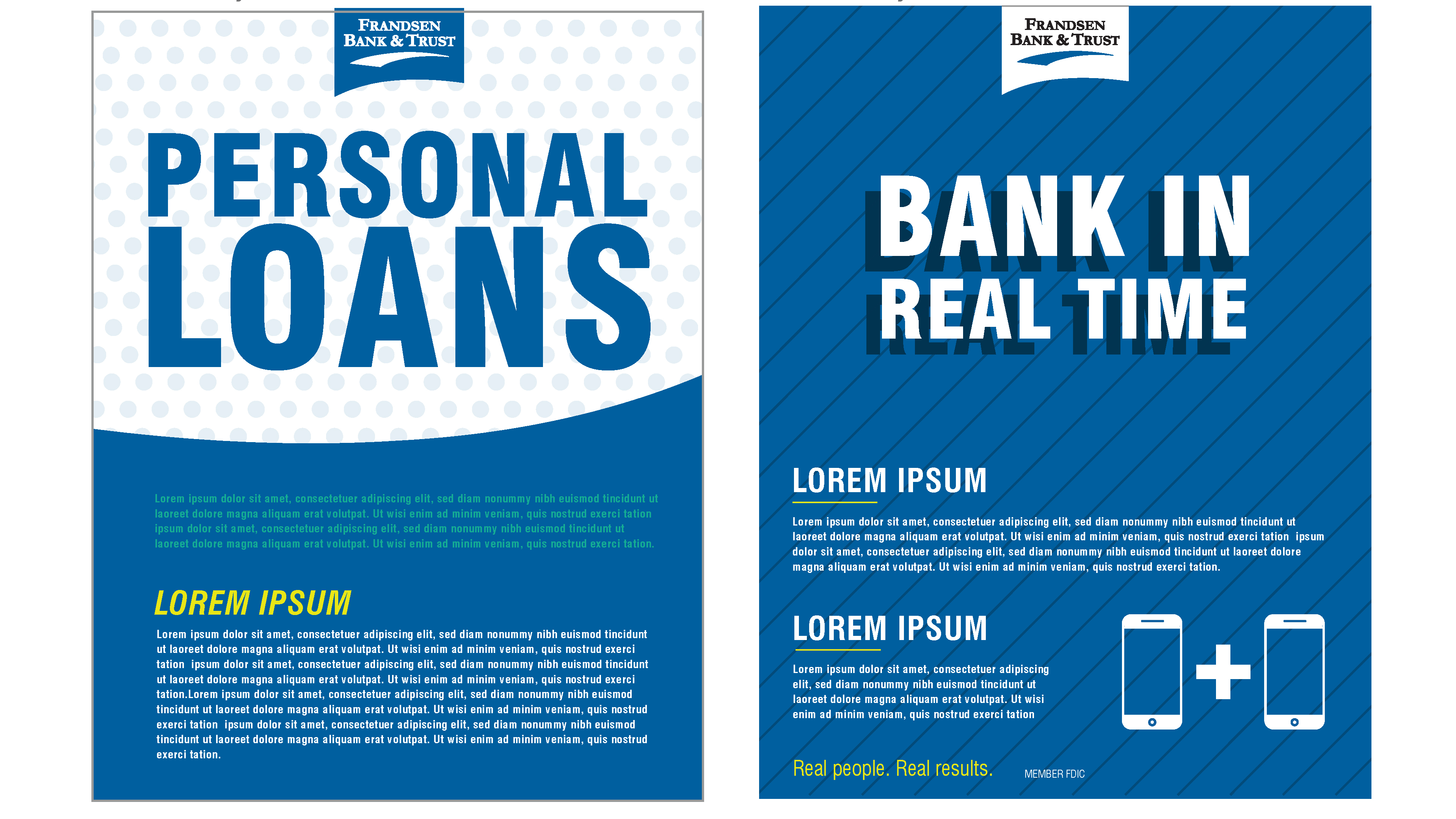
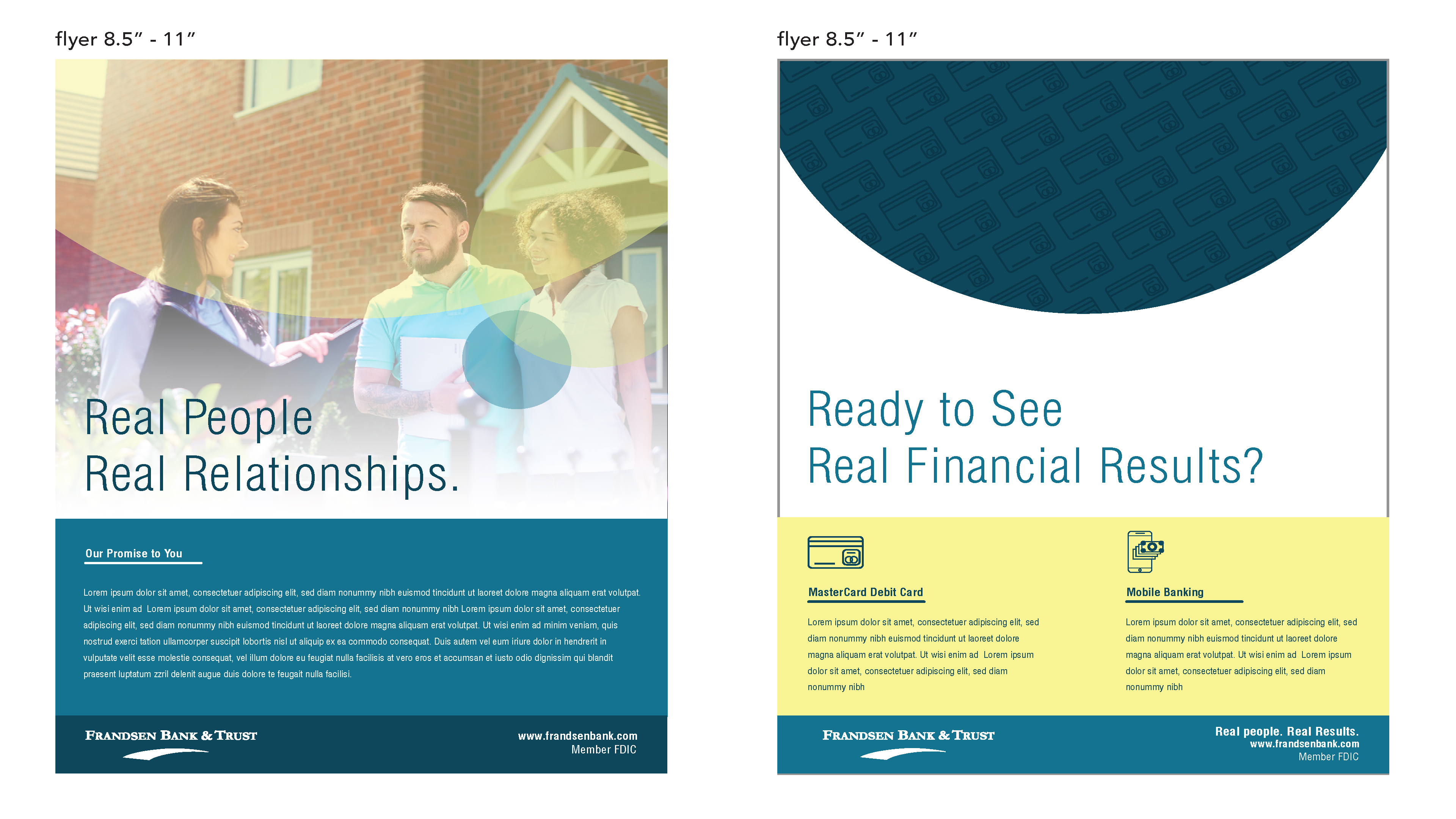
The Frandsen Bank & Trust rebrand delivers a refreshing visual identity that balances professionalism with approachability. The design system employs a vibrant yet sophisticated color palette of teal, lime green, and warm orange that creates visual cohesion across all materials while differentiating service categories. Typography is clean and authoritative, with an emphasis on clear information hierarchy that guides readers through complex financial information. Marketing collateral showcases authentic imagery of real people in their communities and workplaces, reinforcing the brand's tagline "Real People. Real Results." This photography strategy connects with diverse customer segments from homebuyers to small business owners to agricultural clients. The rebrand successfully positions Frandsen as a modern financial institution that maintains its community-focused values and personal approach to banking relationships.