Go To Sleep Campaign
Branding Campaign

Recharge Your Human Battery
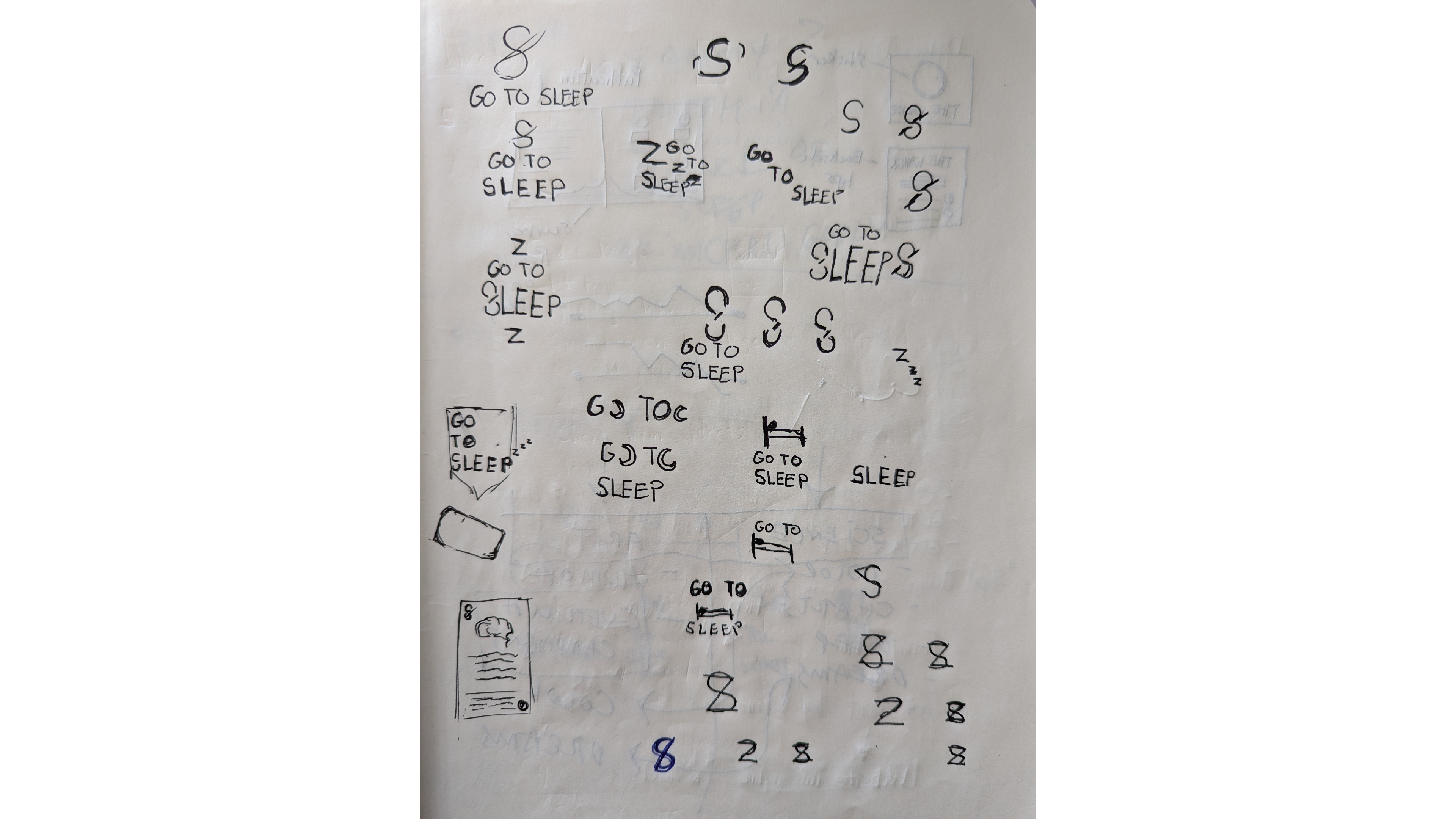
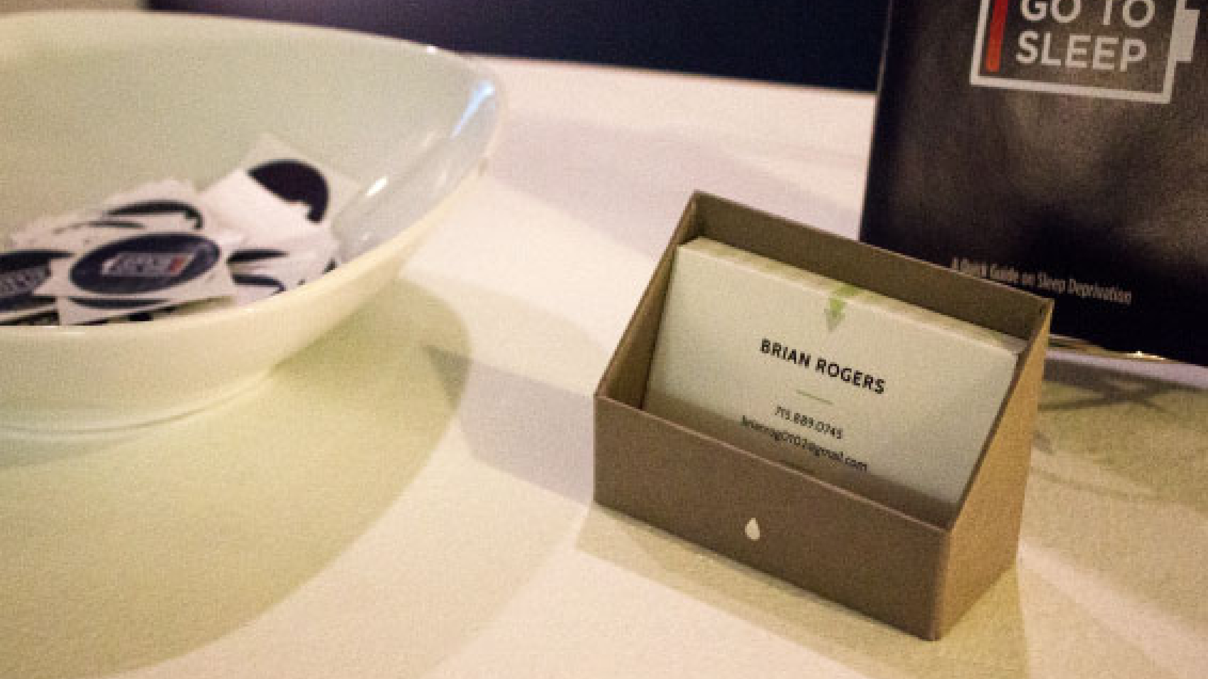
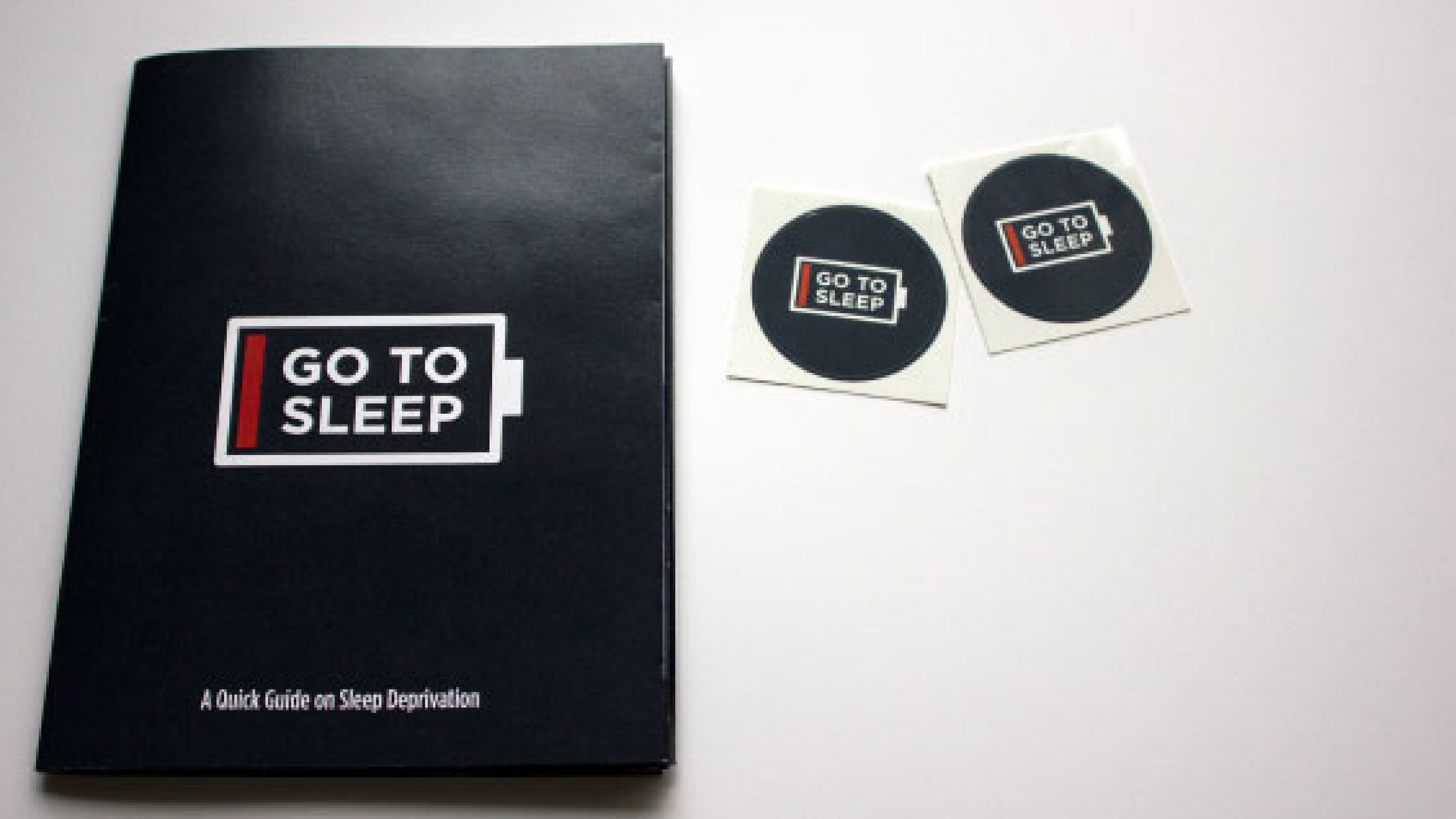
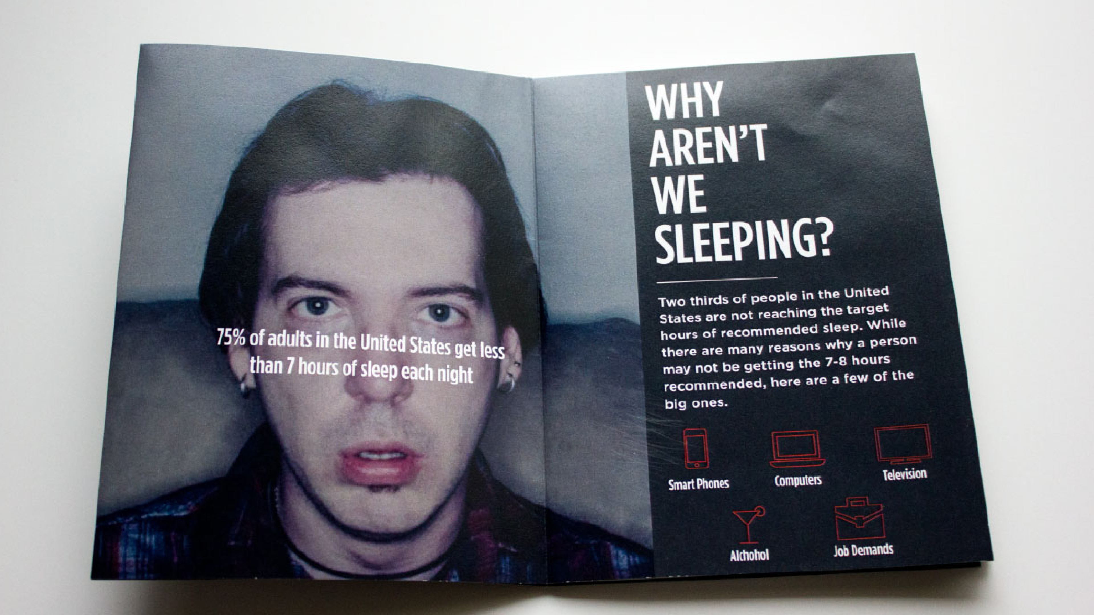
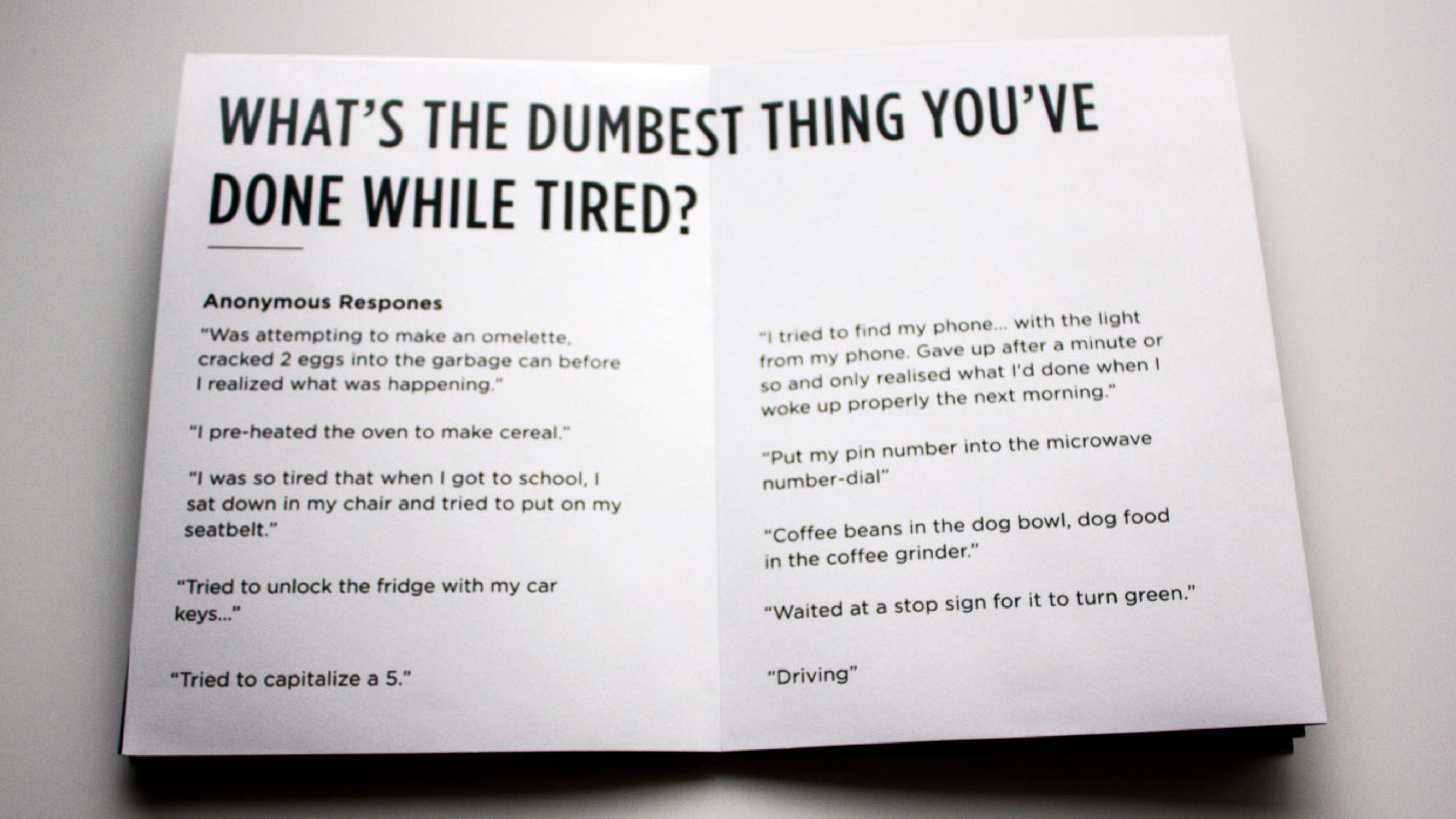
The Go To Sleep Campaign tackles the silent epidemic of sleep deprivation through a striking visual identity that captures both the surreal nature of sleep-deprived states and powerful visual metaphors to confront the crisis of sleep deprivation. The branding cleverly employs a battery icon with a red indicator as its central motif, symbolizing how humans, like devices, need proper recharging. The dark navy, white, and red color palette creates urgency while maintaining a clean, impactful design aesthetic.
